ByJohn A
Custom Sticker Labels Can Make a Product Look Retail-Ready without Making Packaging Complicated
Plenty of good products get let down at the last step. The recipe is sorted, the jar is fine, and then a wonky home-printed sticker tells shoppers this is a hobby. Custom sticker labels are what separate a market stall look from a retail shelf look, and the gap is wider than most people expect.
None of this requires fancy packaging. Custom sticker labels let a plain jar, bottle or pouch look completely retail-ready, because the label carries the branding while the container just does its job. No custom moulds, no expensive packaging redesign, no drama. The jar stays boring and the label does all the talking.
Why a Good Product Can Still Look Homemade
Presentation Gets Judged before the Product Does: Shoppers form a quality judgement from the label before they ever try the product, because it is the only evidence available at the point of choosing. Crooked edges, blurry text and mismatched sizing all read as inexperience. Fair or not, a scruffy label makes people assume the contents were made with the same level of care.
Home Printing Gets Expensive the Longer It Lasts: Printing labels at home looks cheap until ink, sheet stock, wasted misprints and the hours spent trimming get counted, and none of that improves the finished look. In everyday print work, label printers routinely see small brands switch over after a retail buyer comments on presentation. The switch usually happens later than it should.
Plain Packaging plus One Sharp Label Does the Job
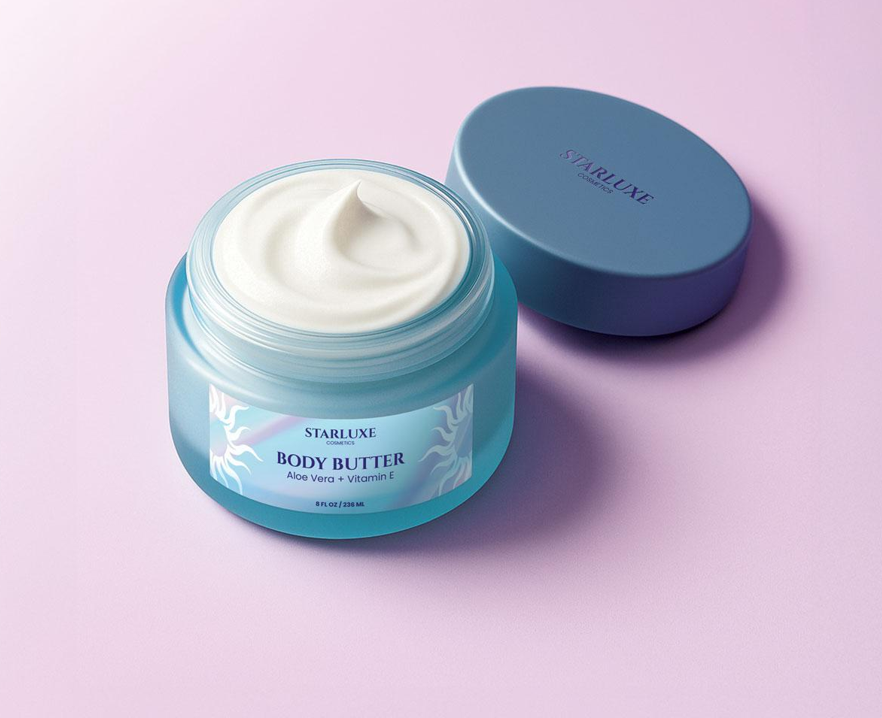
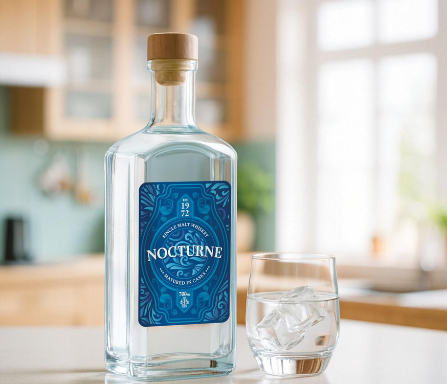
A Professionally Printed Label Upgrades Cheap Containers Instantly: A standard jar or bottle looks premium the moment a properly printed label goes on it, because print quality, accurate colour and a clean cut are what the eye reads as professional. Custom sticker labels do that without changing anything else about the packaging. Same container, same supplier, completely different first impression.
One Layout across Every SKU Keeps a Range Tidy: Branding stays recognisable across a range when every product uses the same layout, font set and colour system, with only the product name changing between them. That repetition builds consumer confidence, since a matched set signals an established business rather than a side project. Different labels for each product achieve the opposite.
Practical Sizes and Finishes Beat Clever Ideas
The Label Has to Fit the Container, Not the Mood Board: Label size should be set by the flat area of the container rather than by how much artwork needs to fit, because a label wrapped around a curve will wrinkle every time. Curved bottles need narrower labels. Flat-sided jars can take more. Measuring the usable panel first saves a whole round of reprints.
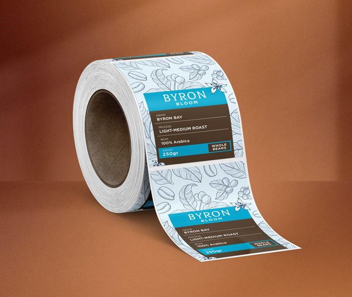
Standard Shapes and Simple Finishes Win on Cost and Speed: Rectangles and rounded rectangles apply straighter, reorder faster and cost less than unusual shapes, which is why most retail-ready ranges stick with them. Specialty shapes suit hero products and premium lines, though they add cost and lock the layout in place. Sharp, simple presentation gives small brands a real competitive advantage on shelf.
Design Choices That Quietly Sabotage a Good Label
Readability Beats Personality Every Single Time: Text on a label has to be legible at arm’s length, so tiny type, low contrast and decorative fonts cost sales no matter how good they look on screen. Script fonts on ingredient panels are a classic own goal. Keep the fancy lettering for the brand name and let everything else stay readable.
Safe Margins Keep Every Label Sitting Straight: Labels apply straighter when the artwork leaves a safe margin around the edges, because tiny alignment shifts during application are normal and unavoidable. Designs that run text right to the border look wrong the moment one label sits a millimetre off. A sensible margin now saves a crooked-looking batch later. Every time.
Checks Worth Running before the Artwork Goes to Print
A Five-Minute Sanity Check Saves a Whole Run: Most reprints trace back to something obvious that nobody checked, and none of it takes long to confirm. Running through the basics before approving custom sticker labels keeps the whole batch usable rather than half of it sitting in a drawer. Print files are cheap to fix. Printed stock is not.
- Measure the flat panel of the container before choosing a label size.
- Check the smallest text is still readable when the file is viewed at actual size.
- Leave a clear margin around every edge so slight misalignment never shows.
- Confirm the same layout and font set carries across every product in the range.
- Order a proof on the actual stock rather than approving from a screen.
See also: Buy Gmail PVA Accounts: A Practical Guide to Choosing Reliable Email Accounts
Looking Retail-Ready without the Packaging Headache
Looking retail-ready comes down to presentation, not packaging budgets. A plain container with a well-printed, well-planned label reads as professional, while a fancy jar with a rough sticker does not. Custom sticker labels give small brands that finish without redesigning anything, which is why they sit behind so many tidy-looking shelves.
A sharp label lifts how a product is judged from the first glance, and it does that on every unit sold. Putting it off means another season of good products being underestimated because of their stickers. Send the container details and artwork to a label printer and get a proof organised.